A knock on both the wind and solar industries is expense, but that issue is definitely it's own post. Expense and efficiency are inter-related components, so neither can be overlooked when attempting to answer the 'big' question above. For now we'll stick to some global maps showing wind and sun patterns, to start thinking in efficiency terms.
Let's start with some useful info for wind turbine placement. The following is taken from a study called "Evaluation of Global Wind Power" by Cristina L. Archer and Mark Z. Jacobson and is a detailed analysis of wind data from over 8,000 wind speed measurements around the world.
'The results are generally more conservative than other regional studies, but even so, nearly 13 percent of the stations recorded sustained wind speeds in the "Class 3" category (6.9-7.5 meters/second) or better, with some few locations topping out over "Class 7" (9.4 meters/second or greater). Generally speaking, with currently-deployed wind turbine technology, Class 3 winds or greater are required for economically useful generation.'
13 percent my not seem like a potent figure, but let's talk translation. The same study predicts that, 'the total wind power potential from economically usable (at current technology) locations amounts to 72 terawatts; the total global electricity use in 2001 was 1.6-1.8 terawatts; the total global energy use from all sources (according to the DOE) was just under 14 terawatts in 2002.'
This study and the subsequent atlas, pictured here, was compiled in 2005. Horrible color choices in the map, but useful info. Review the source article here

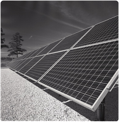
Now let's turn to solar power mapping. The map below is borrowed from an amazing resource Solar4Power.com.


Here also is a concise explanation of the important concept of Peak Sun Hours which is the chief output of the atlas.
'The intensity of the Sun's radiation changes with the hour of the day, time of the year and weather conditions. To be able to make calculations in planning a system, the total amount of solar radiation energy is expressed in hours of full sunlight per m², or Peak Sun Hours. This term, Peak Sun Hours, represents the average amount of sun available per day throughout the year.
The maps and the key show what areas of the planet receive the most radiation. Curiously, it is not necessary to live in high radiation, high Peak Sun Hours locations to harvest solar power, it does effect efficiency in PV systems though. Just a quick look at large scale projects in the Netherlands revealed at least 3 projects producing a combined 2500 mwh's. Lord knows it isn't that sunny here.
It is also important to know that the atlas portrays worst case scenario figures.
'The Peak Sun-Hours reflected in the global solar power maps may differ from other sun-hour figures available because these global maps represent the worst case seasonal PSH (Kilowatt-hrs/m²/day) values used for calculating year-round applications. For solar power applications requiring performance throughout the entire year, the lowest monthly average Peak Sun Hours is used as the baseline - usually the winter low average. For summer-time only solar power applications, the figures in the global maps would need to be considered since summer-time averages are often 30 - 40 percent higher.'


Here also is a concise explanation of the important concept of Peak Sun Hours which is the chief output of the atlas.
'The intensity of the Sun's radiation changes with the hour of the day, time of the year and weather conditions. To be able to make calculations in planning a system, the total amount of solar radiation energy is expressed in hours of full sunlight per m², or Peak Sun Hours. This term, Peak Sun Hours, represents the average amount of sun available per day throughout the year.
It is presumed that at "peak sun", 1000 W/m² of power reaches the surface of the earth. One hour of full sun provides 1000 Wh per m² = 1 kWh/m² - representing the solar energy received in one hour on a cloudless summer day on a one-square meter surface directed towards the sun. To put this in some other perspective, the United States Department of Energy indicates the amount of solar energy that hits the surface of the earth every +/- hour is greater than the total amount of energy that the entire human population requires in a year. Another perspective is that roughly 100 miles square of solar panels placed in the southwestern U.S. could power the country.
The daily average of Peak Sun Hours, based on either full year statistics, or average worst month of the year statistics, for example, is used for calculation purposes in the design of the system.The maps and the key show what areas of the planet receive the most radiation. Curiously, it is not necessary to live in high radiation, high Peak Sun Hours locations to harvest solar power, it does effect efficiency in PV systems though. Just a quick look at large scale projects in the Netherlands revealed at least 3 projects producing a combined 2500 mwh's. Lord knows it isn't that sunny here.
It is also important to know that the atlas portrays worst case scenario figures.
'The Peak Sun-Hours reflected in the global solar power maps may differ from other sun-hour figures available because these global maps represent the worst case seasonal PSH (Kilowatt-hrs/m²/day) values used for calculating year-round applications. For solar power applications requiring performance throughout the entire year, the lowest monthly average Peak Sun Hours is used as the baseline - usually the winter low average. For summer-time only solar power applications, the figures in the global maps would need to be considered since summer-time averages are often 30 - 40 percent higher.'
Solar in countries like the Netherlands is going to be more potent and efficient in Northern hemisphere Summer months. Places like New Mexico are jamming year round.
These maps help us understand that there are certainly some good, some super good and some not so good spots to implement solar, wind and or either. From these charts you can begin to make calculations for expected output from various wind / solar array projects you might want to implement.
One kind of sad / sucky bit of info revealed by the Wind Atlas is that much of countries like China, and many African locations are not sitting in wind rich positions. The hope is that new developements in wind technology will make it possible to harvest wind effectively in locations that are not equal or greater to Class 3.
Common concerns about massive implementation of wind turbines (i.e. millions of wind turbines world wide) are noise, maintenance and death to birds.
I just want to close the post with a wandering thought. Stumbling onto these maps myself, I realize just how alien these Sun / Wind resources are to most of us. Let's face it, at the consumer level, these are peripheral energy sources we just don't encounter as often as petroleum, fossil fuel, and traditional massive grid sources. The illustration of natural patterns makes these mapping projects immeasurably useful and helps to greatly simplify foreign concepts. I can show these maps to my 7 year old son and we can have a rational discussion on Global wind and sun patterns. I like that.

.axd.png)
